How to Rice and Why
One of the many benefits of using free software is that you can customize it at will. On a system like Windows or Mac OS, you can set the wallpaper and maybe change the font for certain applications, and little else; but on GNU/Linux and its kin, you can quite literally modify any aspect of the system you like: not just the wallpaper and the fonts, but the window borders, taskbars, keyboard shortcuts, cursors, and so on.
Many people don't choose to go very far in customizing their operating system, and that is perfectly fine. But if you're interested in how to customize (rice) your system, or want to understand why people enjoy it so much, read on. I'll begin with an overview of the software that people use to rice; this is a pretty basic introduction that can be found elsewhere. Then I'll cover a more novel topic: how to develop a good aesthetic. At the end of the article is a brief list of resources.
Software
Most systems use a display server, typically X11 or Wayland, to manage low-level aspects of the graphical user interface and provide an API for manipulating windows.
On top of the display server, many people install a desktop environment (DE) like KDE or XFCE to provide things like widgets, window decorations, and utilities such as terminals and password managers. If you want to give your system a more maximalist look, or enjoy a more conventional user interface, it's useful to install a desktop environment. Users can extensively customize the appearance of most DEs, with plenty of themes available online. For example, people have made KDE look like Windows XP, while others have given their system the numinous frutiger aero look. The downside to using a desktop environment is that they take up a significant amount of space, with all their assets, libraries, and config files, and the point-and-click interface of most DEs, while intuitive, can be slower than an interface driven by keyboard shortcuts.
Luckily for the minimalists among us, it's not strictly necessary to use a desktop environment. Instead, you can install a window manager. Window managers provide a simplified window management API on top of the X11 or Wayland protocol, and can be configured or extended in various ways.
As a supplement to a window manager, it's common to install some other tools. dmenu is a good application launcher and can also be used as e.g. a bookmark manager. Programs for making widgets and status bars include dzen, conky, and lemonbar. Finally, one of my favorite programs is sxhkd. It's basically a daemon that processes keyboard shortcuts and maps them to commands that you define in a configuration file. Many window managers, such as bspwm, are just a set of commands that you're supposed to call in an sxhkd config. The great thing about all these programs is that they're small and self-contained, but you can combine them however you see fit, or even write your own. In a sense, using a window manager is similar to cobbling together a lightweight desktop environment.
This brings us to the next part of the article--what ricing is really about.
Aesthetics
Taste in graphics is unique to every individual, just like taste in music. It's crucial to develop an understanding of your own aesthetic preferences. An effective method for this is to save or bookmark pictures that appeal to you, similar to what people do on pinterest or tumblr. Every so often, you should go through your collection and think about why certain things look good and others don't, and remove mediocre images so that only the best remain. This process should gradually refine your sense of taste.
There are general heuristics for determining what looks good, like the rule of thirds and the golden ratio. But in my opinion, it's not worth memorizing those rules, because anyone with a developed eye for composition will understand them on an intuitive level. It's better just to spend time exercising the eye as outlined above.
For those interested, I will try to summarize a few principles of my own taste, specifically in the realm of digital images. It may serve as a useful starting point.
For wallpapers, colors should be crisp and blurriness or graininess should occur only in rare cases and as part of a deliberate effect. Widgets, windows, and applications are comprised of straight lines and clearly defined colors, so a blurry or grainy wallpaper may contrast too much with the rest of the system. In interior design, wallpapers are meant to be pretty but unobtrusive: they provide a backdrop for contents of the room. Similarly, desktop wallpapers shouldn't stand out so much that they detract from the windows and widgets floating in front of them.
Photographs tend to work better than computer-generated graphics. The reason for this is that photos are taken from the natural world, which follows an inherent order and proportion that pleases the human eye. Also, abstract graphics tend to be so regular that anything that doesn't look exactly like it (viz. your windows) will clash.
Focal points shape the space of the image and draw the eye in certain directions. While not strictly undesirable, a focal point has a significant effect and you must keep it in mind if you use an image with one. Examples of focal points (this may deviate from artistic/photographic terminology) include horizons, faces, eyes, and irregularities.
Complexity can be reined in by visual hierarchy, so that an image contains many details without overwhelming the viewer.
You should be unsparingly critical when choosing aesthetics for your desktop--you aren't being rude to anyone else, not even yourself, so use your judgement to appraise things as honestly as you can. It's like picking out produce at a market: you'll be using it later on, so you want the best quality available.
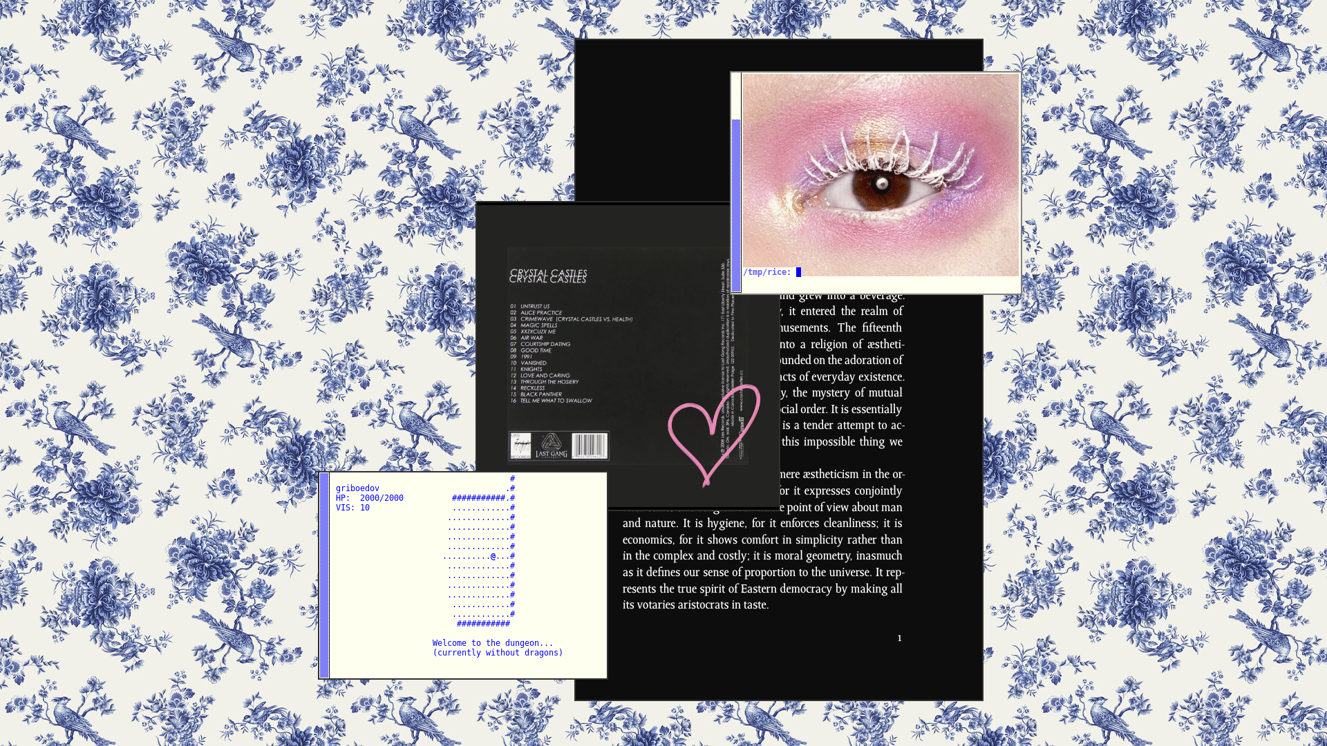
Take inspiration from cassette tape covers. They tend to look unusually good for some reason.

Label, Japan. This label exemplifies good principles of design. I don't know Japanese, so apologies if it says anything inappropriate.
This is a good counterexample. Consider the sense of space and perspective, the colors, and the subject matter. Do you think it would make a good wallpaper?
There are a lot of premade color schemes like Gruvbox, Nord, Solarized, and Zenburn, available for most open-source applications. They look pretty good on their own, but may not match the wallpaper. Furthermore, if you use the same premade theme for everything, it can be an eyesore. It's like wearing all denim. These themes are also so common that you miss out on an opportunity to express something unique about yourself.
I recommend making your own color schemes. You can find a couple that you like and modify them just a little bit, and maybe mix them together into something personally appealing. Simple themes tend to be better. I find that it's best to stick to a basic "backbone", like black text on an off-white background, with a set of analogous colors (like shades of blue) and a couple contrasting highlights, used infrequently. Many applications draw from a specific palette of colors like the X11 colors or Web colors. Using these palettes can help your color schemes harmonize with other applications. As long as your color scheme is simple, you should only need a few variants (e.g. light and dark) to coordinate with most wallpapers.
Another approach is to use pywal to automatically generate a color scheme from a background wallpaper. Though convenient, it isn't a silver bullet--you still need to choose a good wallpaper, otherwise your color scheme will be muted or incoherent. It's also not always desirable to use a color scheme similar to your wallpaper; you might want it to contrast instead. Personally, I'm something of a Neanderthal and don't often use complicated toolchains like this--instead, I've settled on two or three basic themes.
Fonts are another area of interest. If you've chosen a nice font, it tends to look alright if all your applications use that font, but having a few different fonts that look good together is even better. Bitmap fonts are always trendy, but be warned: if you use bitmap fonts and post a screenshot of your desktop, the text will often be distorted by scaling or compression. This is because bitmap fonts tend to be skinny and pixelated, so images without pixel-perfect fidelity will come out wrong. The verticality of your fonts will also effect the sense of proportion. I try to use monospace fonts with gentle shapes and even proportions, such as Code New Roman and DejaVu Sans Mono. Wikipedia has a good list of monospaced typefaces.
When it comes to finding wallpapers, I usually look on tumblr and Wikipedia. As it turns out, many of the images on Wikipedia have a fantastically high resolution. Having a suitably high resolution for your screen(s) is critical, because the artifacts introduced by scaling can ruin a wallpaper. There are some pictures that are too small to be a wallpaper, but have a lot of whitespace; this whitespace can be extended to enlarge the wallpaper without loss of quality. You can also tile really small wallpapers, which works nicely in certain cases.
There are plenty of subreddits dedicated to wallpapers, but in my experience they're of consistently poor quality.
Aside: Showing Off
If you want to share a screenshot of your desktop rice, it's common to show off a combination of programs that you use, often in a slightly contrived way. In other words, many rices are not candid shots.
You can find rice threads on reddit and various imageboards and forums, such as nixers.net. At the time of writing, the imageboards lainchan and arisuchan are not too edgy and you can find rice threads there, but the posting style is formulaic--more similar to reddit than you might expect.
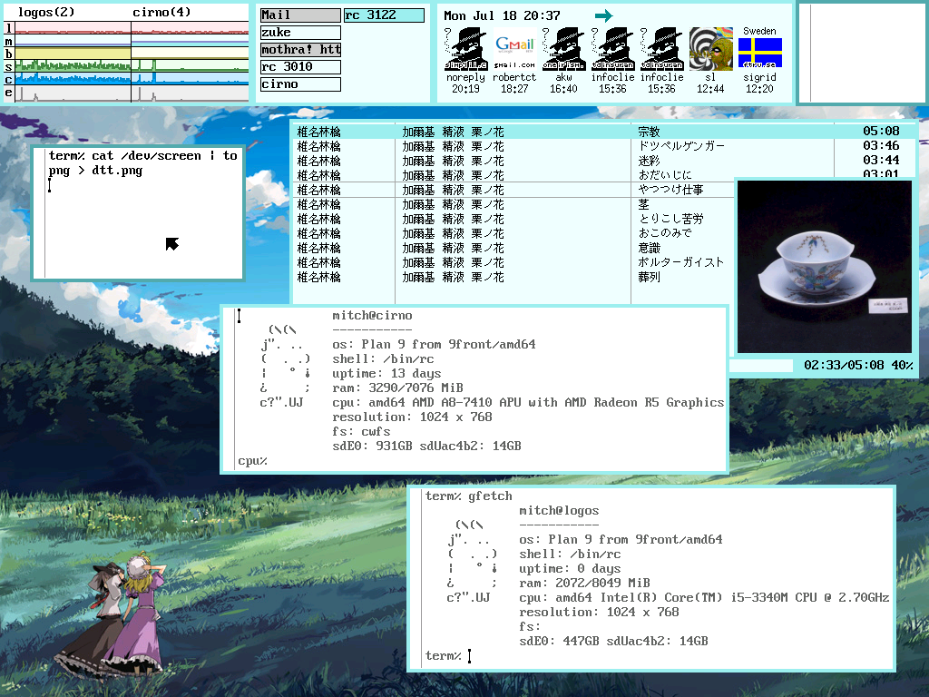
Minimalism is a good starting point. Choose a good wallpaper and one or two applications with a custom font and color scheme; arrange the windows in a pleasant way with respect to the wallpaper (around a focal point, if one exists, with consistent spacing between proximal windows). Develop your ricing skills from there.
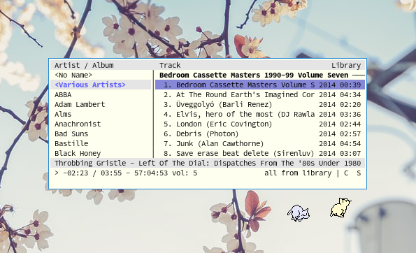
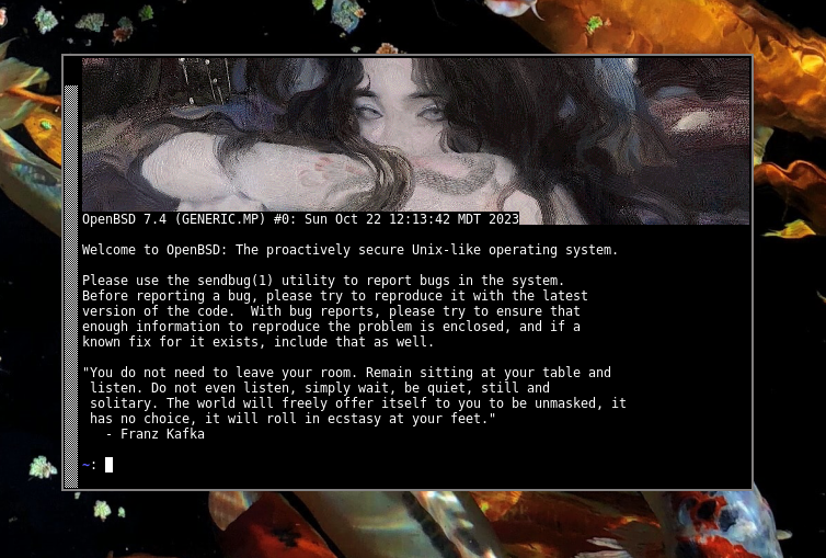
Typical "eye candy" applications include neofetch; mpd clients; mpv; feh; ueberzug; a text editor of your choice; a pdf reader such as mupdf; WinAmp or its free clone, Audacious; and terminal applications like img2sixel and nethack. You only need to include one or two of these, since having many eye-catching applications open will result in confusion. The content in these windows is also significant. Videos and images can complement the wallpaper and color scheme; and music, source code, and pdfs can all provide an ironic glimpse into your intellectual life.
Also, if you have a status bar, you should show it off in all its splendor--for example, if it displays the song being played by mpd, put some cool music on when you take your screenshot.
Favorite Software
- XTerm with the sidebar enabled
- feh (for setting background)
- img2sixel
- mpd and ncmpc
- lemonbar
Gallery
Links
In Closing
Ricing is a source of joy, a celebration of freedom, and an expression of an individual's unique inner vision. The nature of open-source operating systems presents amazing opportunities for customization. Although Linux has been around for 30 or so years at the time this was written, the full extent of ricing has not yet been realized.